UI/UX trends in 2026: what's actually changing interfaces
Typography instead of stock photos, bento grids, motion with purpose. The UI/UX trends of 2026 that are genuinely changing how sites look and work.
An interface that looked modern in 2023 looks like a template with swapped photos today. That's not designers getting bored. It's the effect of user expectations rising faster than most companies can update their sites.
In 2026, UI/UX trends have reached a point where a few things clearly separate projects done with thought from those done on autopilot. None of them are new ideas. All of them have been building for several years. But they've become visible enough now that not knowing about them shows.
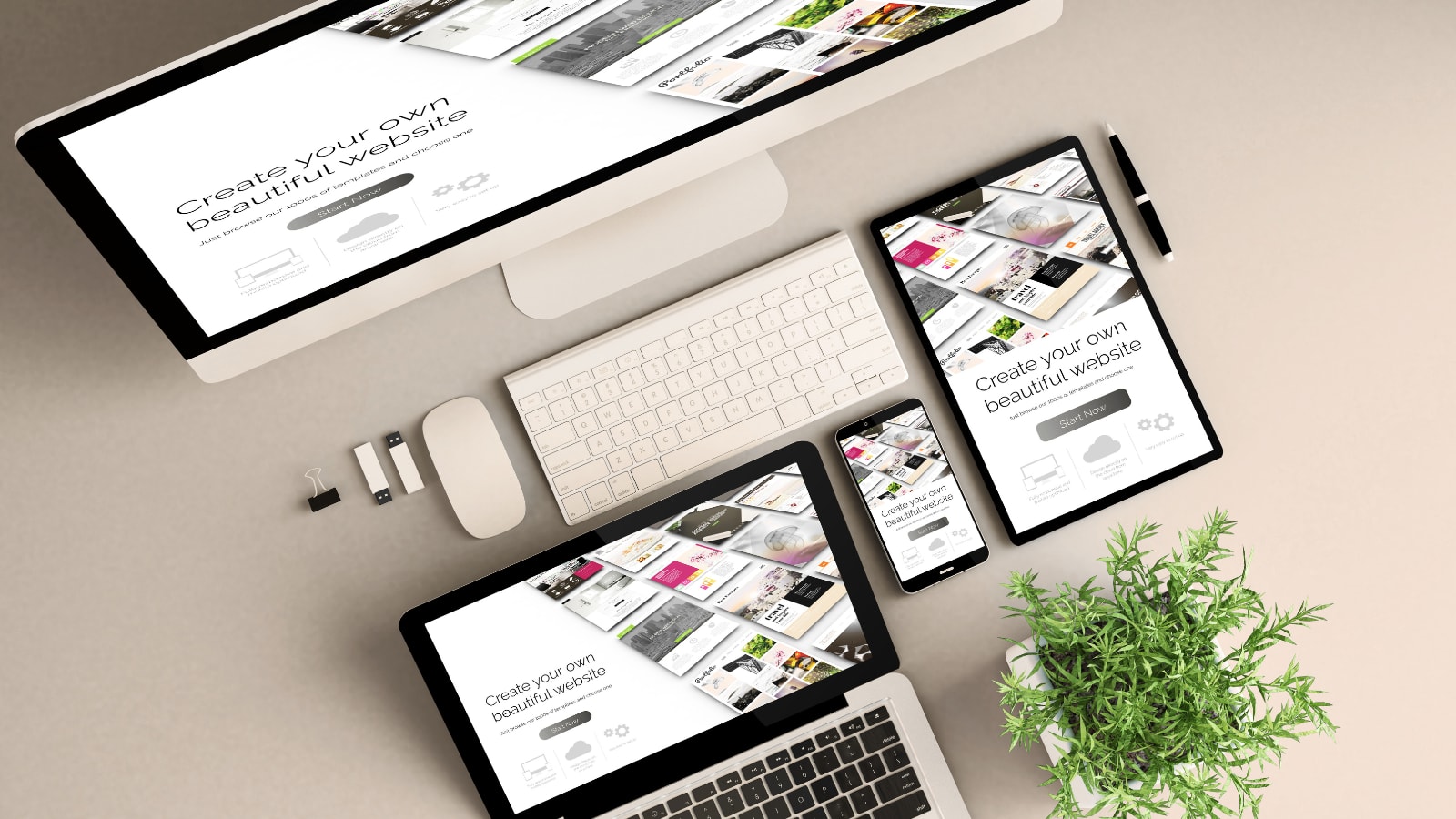
Typography doing what photos used to do
For years, sites opened with a large stock photo of smiling people and a 3-line headline pasted over the middle. That pattern isn't dead, but it's lost its monopoly on what "modern" looks like.
More and more projects build their first impression entirely on typography. Large, decisive headings, a carefully chosen typeface, precisely set kerning and line height. Text that doesn't explain itself with a photo but speaks for itself. A significant portion of good European portfolios and agency sites work this way. We do the same, and it's not nostalgia for typography but a design decision.
Part of the reason is purely technical: variable fonts. A single font family with a built-in range of weights and widths. Instead of loading 6 separate font files, you load 1, flexible, with any step between Light and Black. Sites that switched to variable fonts cut load size by hundreds of kilobytes. At the level of performance that directly affects Google rankings, that's not a detail.
The visual effect also changed what distinguishes sites from each other. If everyone is using the same component libraries and the same stock photos, the only remaining means of expression are typography and layout. That's where the decisions that separate a brand from its competition now live.
Designing for the thumb, not the cursor
Over 70 percent of traffic on most sites now comes from mobile devices. But there's a real difference between "the site works on a phone" and "the site was designed for a phone." Those aren't the same thing.
A hamburger menu takes 2 taps. Navigation placed at the bottom of the screen takes 1. Moving primary navigation to a bottom bar, standard in mobile apps for years, is starting to appear on well-designed marketing sites. The reason is ergonomic: the bottom third of the screen is where the thumb reaches. Putting the primary action there removes friction.
Hover states don't exist on touch. Any design that reveals information or changes appearance on cursor hover creates a dead end on touchscreens. This is still a common mistake on many sites, most visible in dropdown menus that expand on hover on desktop but simply don't work or require accidental taps on mobile.
Performance as a design decision, not a technical one
A site that takes 4 seconds to load instead of 1.5 loses roughly half its users before anything appears. Google has been measuring this for years and it feeds directly into rankings. But speed has stopped being purely a developer's problem. It's now a design constraint that has to be factored in before the first visual is produced.
In 2026, Google measures 3 things: LCP (how fast the main content appears), CLS (whether elements shift while the page loads), and INP (how fast the page responds to clicks). Each of those metrics has a direct link to design decisions. A large hero image above the fold is a potential LCP problem. A typeface loaded without space reserved for it causes CLS. Heavy JavaScript handling animations raises INP.
A designer who doesn't know what Core Web Vitals are delivers mockups that the developer either has to break to make fast, or leave as-is and accept a low ranking. That's not a good situation for anyone.
In practice: before deciding you want a background video on the home page, it's worth knowing that an 8 MB file playing on autoplay on mobile will block everything below it from loading. Before picking 4 different typeface families, it's worth knowing that each one is a separate HTTP request. These aren't arguments for boring sites. They're arguments for choosing visual effects consciously, not because someone saw something similar on Dribbble.
Bento grids and modular layouts
Apple popularised the format, but the pattern goes further back. A bento grid is a layout where differently sized modules, cards, sections, blocks, arrange themselves into a consistent grid. Each module does one thing: shows one product feature, one quote, one statistic. The layout says: "we have a lot to show, but it won't all hit you at once."
In 2026, the format appears not just at big tech companies. Agencies, studios, SaaS businesses, startups: everyone reaches for it on product feature pages and about sections. It works because it's legible on mobile without rebuilding. Cards stack into a column, the hierarchy stays, nothing gets lost.
There is a flip side: bento grid is popular enough now that it's recognisable as a pattern. If your site looks like the same bento as 10 others, none of them stand out. The tool is good, but only when the project has something to say before it decides how to show it.
Motion that means something
Animations entered web design's mainstream a few years ago when libraries like GSAP and Framer Motion stopped requiring advanced expertise to get decent results. Now almost every new site has some motion. And almost half of those animations do nothing beyond drawing attention to themselves.
An animation that adds value is one that communicates something or serves a purpose. A scroll reveal that uncovers content in the order the design wants to show it. A button state transition that confirms an action succeeded. A skeleton screen instead of a spinner: the user sees the shape of the content before it loads, which makes the wait feel shorter. These are UX decisions, not decoration.
We have clients who look at a portfolio and ask directly: "will the site move that smoothly?" That question came up occasionally 3 or 4 years ago. Now it's standard. Motion has become part of the expectation, not a differentiator.
One condition that can't be skipped: animations work when the site loads fast. A scroll reveal on a site that takes 5 seconds to load doesn't rescue the impression the user already formed in those 5 seconds. Performance first, effects second. Always in that order.
Flat design is back, but not the 2013 version
A few cycles ago, everyone abandoned flat design in favour of glassmorphism and neumorphism: soft shadows, blurred backgrounds, frosted glass effects. Both directions dominated the trends for several months and both are now fading.
We're returning to flat. But not the 2013 version.
This time it's about layouts with clear edges, contrast built on colour and typography rather than shadows and transparency. Textures are returning in a subtle way, not as retro pastiche, but as a response to the fact that OLED and Retina screens show grain and texture in a way that looks genuinely high quality. A thin, embossed line separating a section looks better than a card shadow with a gradient.
For designers who have spent recent years building aesthetics from layers of effects in Figma, it's a mental reset. For users, it's just sites that are readable and don't feel like a Behance demo from 5 years ago.
A trend is a choice, not a checklist
Each of these trends is an argument for design being a conscious decision, not the output of a tool's default settings. A site that looks good in 2026 looks that way because someone knew which of these things to choose and why, not because they used the template with the most GitHub stars.
Related articles
